

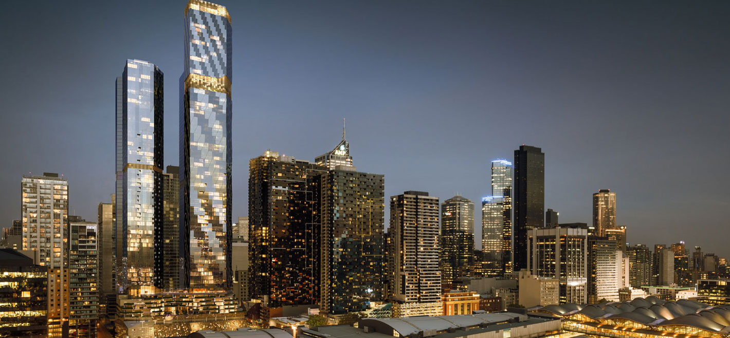


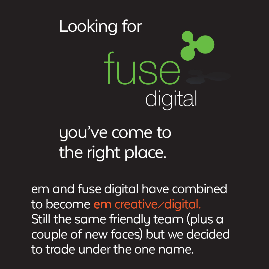
A full-service creative & marketing agency.
Reaching and connecting with customers
when it matters most……
with strategically aligned creative
and execution across multiple channels.
branding. design. web. digital

what our clients say about us/
-

Dear Joe, Lesley & em team, This rebranding isn’t for wimps, is it? But, boy oh boy, don’t we look (sound and feel) fantastic! Signs, cards, office, website, cars, uniforms – all updated. And it is thanks to you. It has been such a fabulous result. We just didn’t need to compromise on anything. You really made the journey very pleasant and we so enjoyed working with you.
Jen Carr, Owner/Director, Niche Luxury Accommodation
VIEW PORTFOLIO -

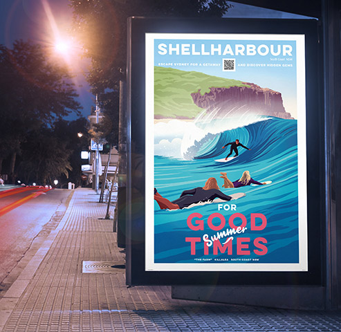
Being in travel, Covid impacted heavily. We had to abandon glossy brochure printing and suddenly market digitally. We reached out to EM. I set the parameters - no industry standard, boring digital flip brochures please. I wanted something really interactive, impactful and easy to use. Something pretty well ground-breaking. Not much to ask for really! EM were all ‘ears and ideas’. I am absolutely blown away by their creativity and understanding, producing an incredible digital brochure absolutely exceeding my wish list. And our clients and trade partners love it! Thank you, EM, thank you Denise and Lesley.
View Interactive BrochureEuan Landsborough, MD
VIEW PORTFOLIO -
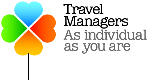
A professional and pro-active team with outstanding expertise and experience in both traditional and digital media. Our specific requirements were challenging and complex, however this was never evident during the design and build of our new website, nor the design of our newly branded collateral. Attention to detail and customer satisfaction are not just standard phrases – they live by them. And to top it all off, the team at em creative/digital are an absolute pleasure to deal with! I have no hesitation in recommending their services and look forward to working with them again very soon.
Chrissy Tayfield, TravelManagers
VIEW PORTFOLIO -

Over the last five years, the team at em have provided a dedicated and extremely professional service for our needs, allowing us to implement numerous projects. We are extremely happy with the end results and I am delighted to recommend them.
Martin Edwards, Bench International
-

Degremont Australia contacted em to design, project manage and develop our new company website. Right from the outset we found the team at em was very knowledgeable, reliable and responsive. The project manager guided us through each phase of the web development process. The end result was a creative, fresh and fully functional website that meets our needs and stands out amongst our competitors. Degremont Australia highly recommends em for any website and digital marketing needs.
Stuart Fagan, Strategic Marketing Advisor
VIEW PORTFOLIO -

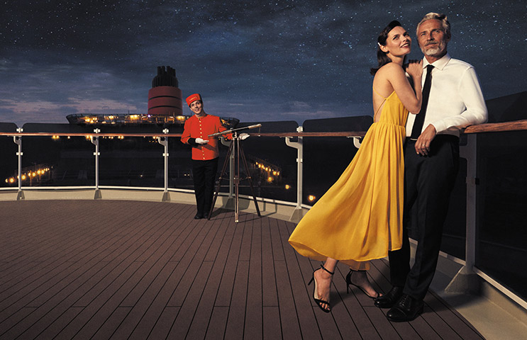
World Cruise 2019 was the biggest booking day on record for Princess Cruises. By working across all touchpoints for this release, em creative was able to assist in the coordinated and integrated delivery of these assets to both consumers and travel agents, ensuring a successful launch day and continuing to stimulate demand for this voyage. Presently it is over 70% sold, with more than 14 months to departure.
Chloe Jones, Princess Cruises
VIEW PORTFOLIO
view all testimonials
